



Case Study
National Symphony Orchestra
Bringing a great British orchestra to life online
"Tom has brought the orchestra to life online. For years our website made us look small. Now it looks, moves and even sounds like the National Symphony Orchestra, and a producer can see who we are, hear what we do and get in touch in a minute. Best of all, I can update it myself between rehearsals."
Justin Pearson
Managing Director and Artistic Director, National Symphony Orchestra
2 weeks
Site designed and built
100+
Pages designed and rebuilt
45 of 45
Old links kept working
The Problem
The National Symphony Orchestra has a story most orchestras would envy. It traces its history to wartime London. It has recorded for Decca and at Abbey Road, played on film and television soundtracks, toured internationally, and recorded a Beethoven symphony cycle. Producers, studios and promoters book it for everything from film scores to concerts at sea.
You'd never have known any of that from its website.
nso.co.uk was an ageing WordPress theme: a slideshow, long grey pages of text, and almost nothing to look at, listen to or click. The news had stopped in 2021. Musicians' pages hadn't changed since 2018. The orchestra's current season wasn't on the site at all; it lived on a separate Google Site. Because the theme loaded its content with JavaScript, Google and AI assistants saw barely any of it, and the little they did see competed with the Kennedy Center's National Symphony Orchestra in Washington DC, which dominates the name.
Worst of all, the site didn't speak to the people who pay the bills. Producers, fixers, studios and promoters had nothing written for them: the hire offer was buried in a 3,000-word page with the wrong name, and the orchestra's music library business was hidden behind a URL nobody would ever guess.
Justin Pearson, the orchestra's Managing and Artistic Director, wanted a site that felt like the orchestra sounds, and one he could update himself between rehearsals and tours.
The Solution
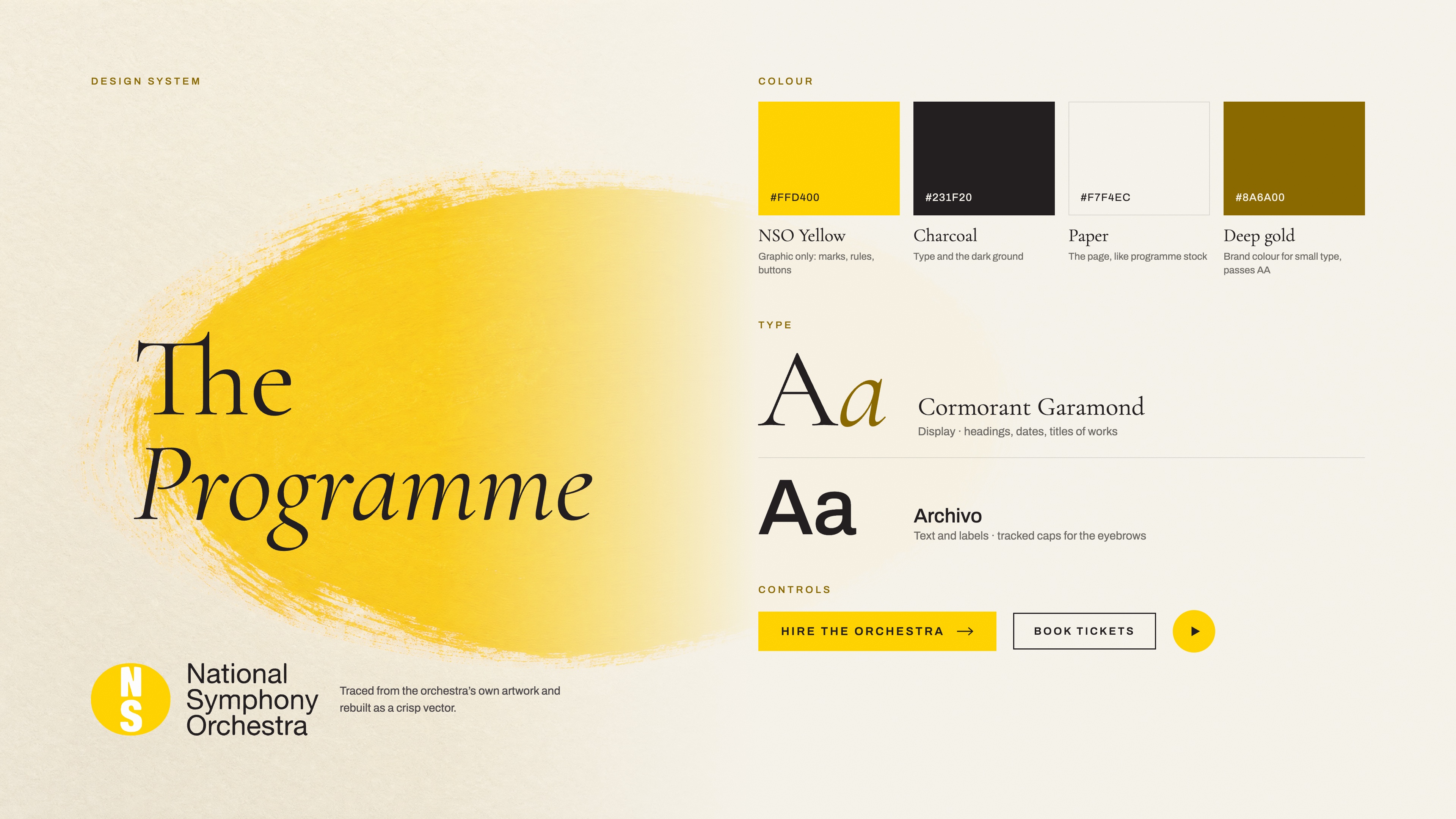
A visual identity built from the real thing. Before designing anything I went back to the orchestra's own brand. Its logo, a yellow ellipse holding a stacked "NS", existed only as a soft PNG, with no vector anywhere. I rebuilt it as crisp SVG and took the palette straight from it: NSO yellow and charcoal.
The creative direction became "The Programme": a website that feels like the printed programme you're handed in the foyer of a great concert hall. Warm paper, deep charcoal, an elegant classical serif (Cormorant Garamond) set against a clean modern sans (Archivo), and the yellow used sparingly, like a highlighter, so that when it appears it means something. The yellow is beautiful as a block of colour and unreadable as small text on paper, so it became a graphic device, with a darker gold for small type. The site feels unmistakably NSO and still reads well for everyone.
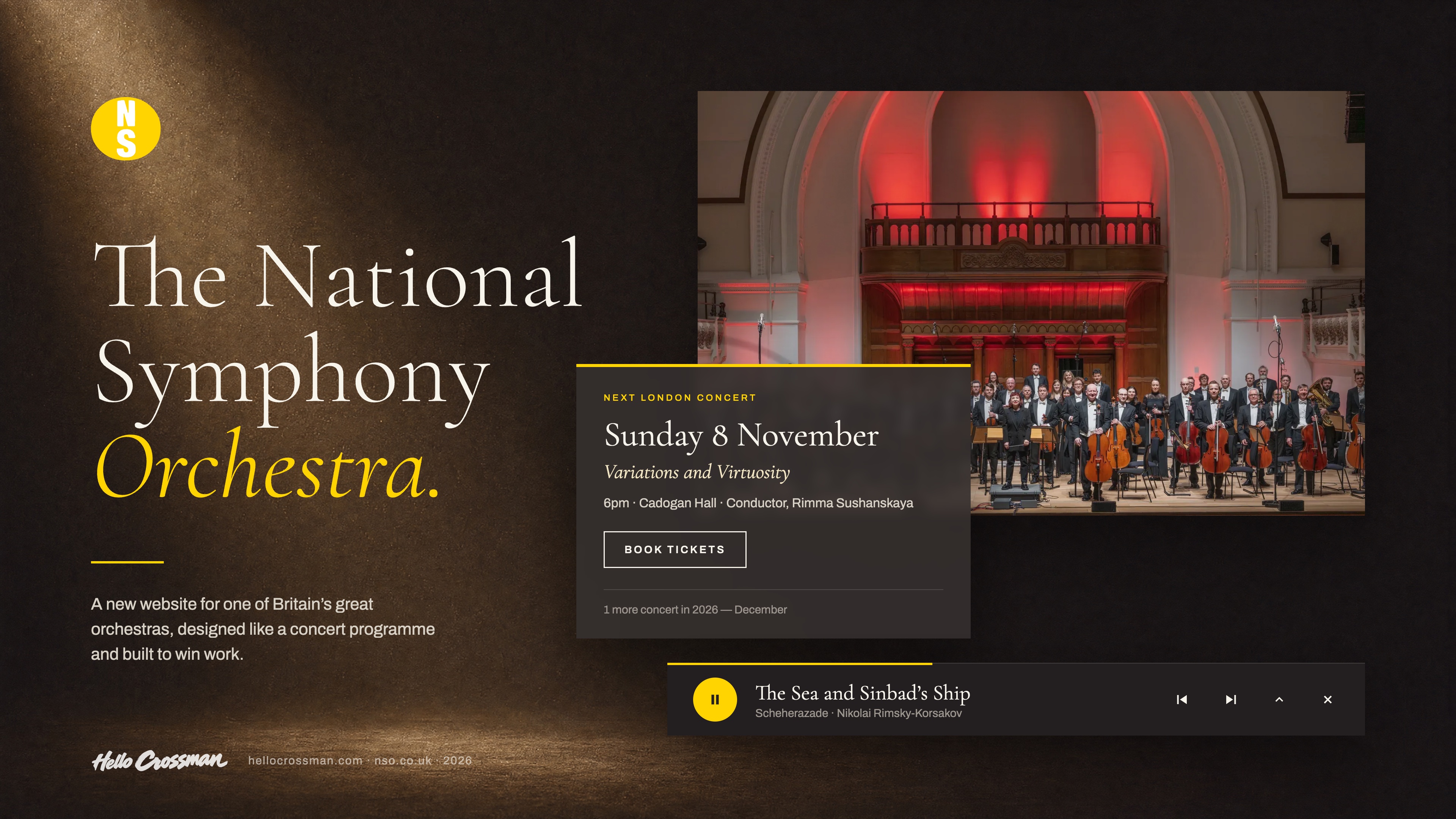
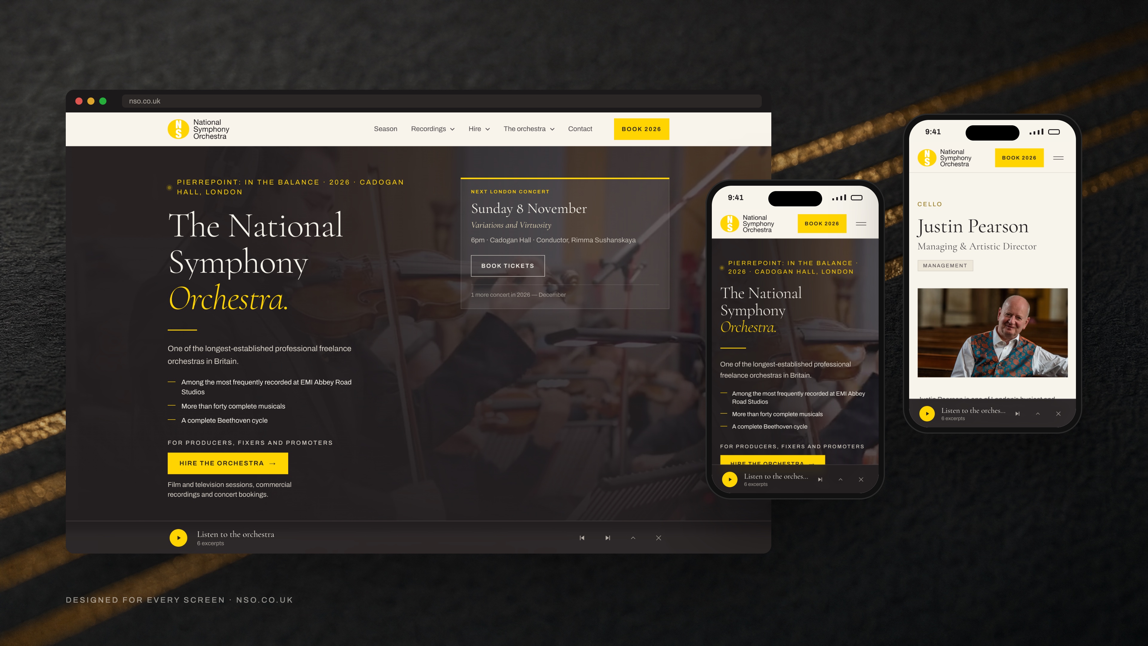
A homepage that moves and plays. The homepage opens on charcoal with the orchestra's name set large, the next London concert in its own panel, and a single line that does the pitch to a producer. Behind the type, film of the orchestra at work drifts in once the page has loaded, and the hero eases away with a subtle parallax as you scroll. Lower down, the page alternates between dark and light like movements in a symphony, every section has its own entrance, and concert listings open in place to reveal the full running order.
Music you can hear while you browse. An orchestra's website should make a sound. Excerpts from the orchestra's own recordings play through a persistent player that docks at the foot of the screen and keeps playing as you move from page to page, so you can read about Scheherazade while you hear it. Nothing ever autoplays. The homepage also carries a Spotify player built from the orchestra's own playlist.
A history page with a wow moment. In 1941 Sidney Beer assembled an orchestra in a London with almost no orchestral music left in it, and three months after it began playing at the Queen's Hall, the hall was gutted by an incendiary bomb. On the old site that story read like a newspaper article. Now it's a pinned, scroll-driven sequence: the page fades to black, the rule across it goes out, and a single sentence holds on its own. No flames, no sound effects. The restraint is what makes it land. Around it, the history is told through real archive artefacts: an original Decca 78, wartime concert programmes, and a 1945 Royal Albert Hall programme featuring Pablo Casals.
Long pages that read like a magazine. Rather than cut the orchestra's long copy, I designed an editorial chapter treatment: the heading held in a left rail, one line lifted from the text and set large as a pull quote, the prose in a comfortable measure alongside, and images where they belong.
No dead ends. Every page ends with somewhere to go next, and the site closes on the orchestra's next concert, so whoever reads to the bottom of any page is one click from booking it. New pages settle in gently as you navigate, without ever slowing the site down.
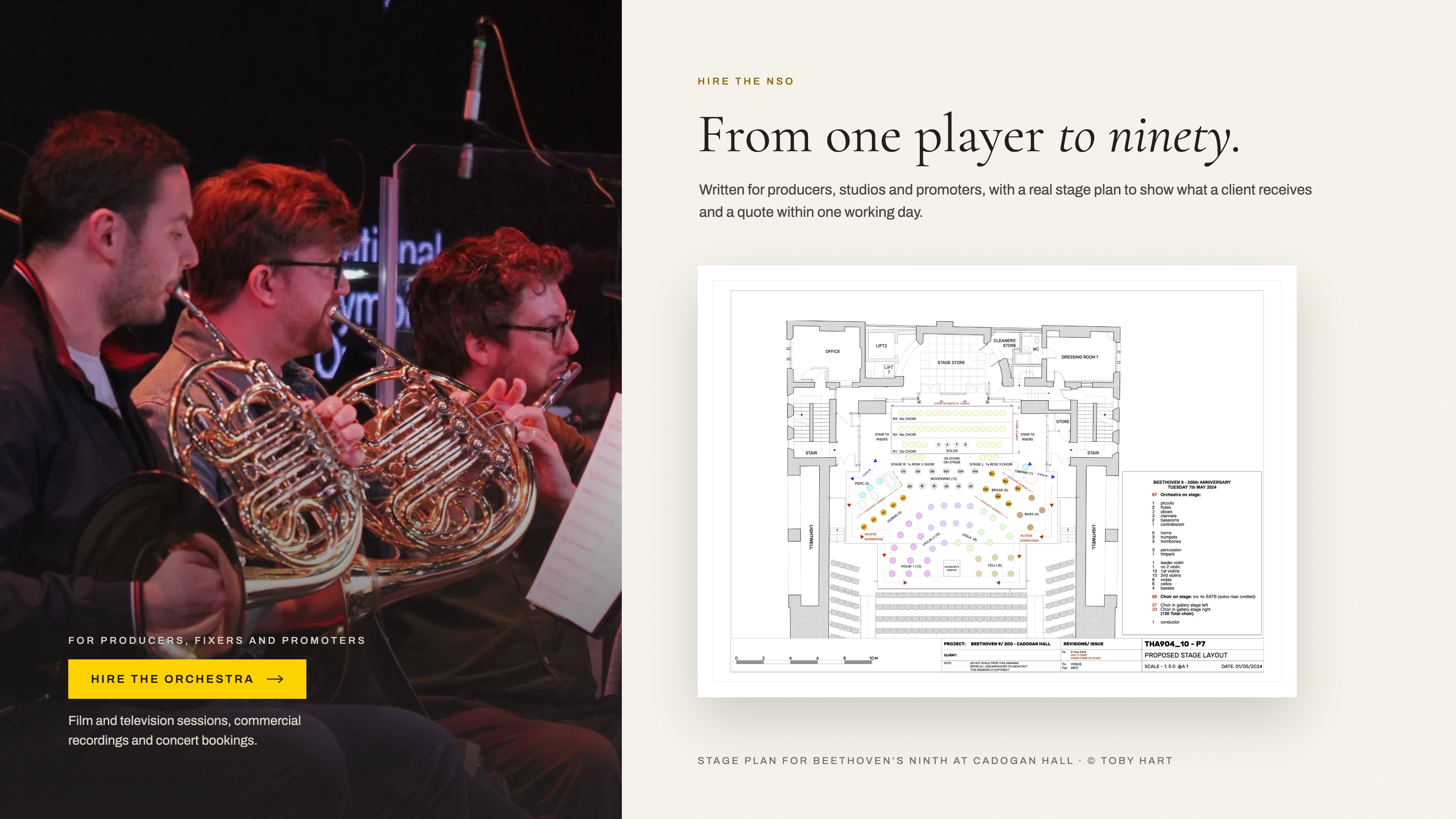
Built for the people who hire the orchestra. Underneath the flair, the site has a job: winning work. The homepage puts hire first, with the solid yellow button reserved for it. The Hire page sets out what a client gets: ensemble sizes from one player to ninety, a real stage plan drawn by the orchestra's manager, its screen and commercial work, and a one-working-day quote turnaround. Every enquiry goes straight to the right person, and the music library has its own page and enquiry form for the first time.
A catalogue that links everything. Every recording, film, TV series, musician, composer, venue and concert has its own designed page, and they all connect. Film and TV credits sit in a Watch section with clips that stay a still picture until you press play, and concerts can be added to your calendar in one click.
An admin the orchestra runs itself. The whole site, down to the homepage's own headline and statistics, is editable by the team without a developer. Clear a box and it falls back to the original wording, so nobody can break anything that can't be put back.
Fast, accessible and found. Anything heavy loads only when it's needed, every animation has a calm equivalent for people who've asked their device for reduced motion, and the site is designed to the WCAG accessibility standard. Every page tells Google and AI assistants exactly which National Symphony Orchestra this is, and every one of the old site's addresses forwards to its new home.
Key Features
"The Programme" design system
A visual identity built from the orchestra's own logo and colours: warm paper, charcoal, classical serif type and NSO yellow used as a highlighter, so the whole site feels like a printed concert programme brought to life.
Music that follows you
A persistent audio player that keeps playing excerpts of the orchestra's own recordings as you move between pages, plus a homepage Spotify player of the orchestra's playlist.
A homepage with motion and rhythm
Ambient film of the orchestra behind the hero, scroll-linked parallax, staggered entrances, and sections that alternate between paper and charcoal like movements in a symphony.
The 1941 blackout sequence
The history page's centrepiece: a scroll-driven moment where the page goes dark for the night the Queen's Hall was bombed, set around real archive artefacts and a dated timeline of record sleeves.
Built to win hire work
A homepage and Hire page written for producers, studios and promoters: ensemble sizes from 1 to 90, a real stage plan, screen and commercial credits, and enquiries routed straight to the right person.
Run by the orchestra
An admin covering every page, from concerts and news to the homepage headline and stats, with safe fallbacks so the team can't break what they can't put back.
Gallery


The Results
The new nso.co.uk launched on 30 October 2026, and for the first time the website looks, moves and sounds like the orchestra.
A producer landing on the homepage can see in moments who the orchestra is, hear what it sounds like, see what it has recorded, and ask for a quote. A concertgoer can find the next London date, hear the orchestra, and add the concert to their calendar. The orchestra's story, from the 1941 blitz to film and television sessions today, is something people now want to scroll through rather than skim past.
The launch itself was invisible to visitors: every old link still works, email on the domain carried on untouched, and the switch happened without a moment of downtime. And because the team runs the site themselves, it stays current. Within hours of going live, the homepage was playing a new Spotify playlist of the orchestra's own recordings, made by its orchestral manager.
The Build Story
Justin Pearson is a cellist with a long career in film and television sessions, and he runs the National Symphony Orchestra. When we first spoke, his frustration was simple: the orchestra had an incredible story and the website made it look small.
We started with the brand, not a blank canvas. The orchestra already had a logo and a colour, even if both were trapped in low-resolution images, and a poster for its 2026 season had more personality than the entire website. I pulled those apart, rebuilt the logo, and designed around them. The first round of ideas was too conceptual; the second invented its own palette. The third, built on the orchestra's real yellow and charcoal, became "The Programme": the idea that the site should feel like the printed programme in your hands before the lights go down.
Then came the fun part: making it move. I wanted the site to feel alive without ever feeling like a gimmick, so every effect had to earn its place. Film behind the homepage hero, a player that keeps the music going as you browse, concert listings that open to reveal what you'll hear. The history page was the one I kept coming back to. It was beautifully written and read like a newspaper. It needed a wow moment, and the night the Queen's Hall burned in 1941 was it. The sequence I built for it deliberately does very little, and that's why it works.
Justin's reaction in our September walkthrough was to the admin: he could change the site himself. Toby Hart, the orchestral manager, then went through every single page and sent back a detailed review. His photographs are now used throughout the site, his stage plan is on the Hire page, and his notes shaped everything from the order of the musicians to which collaborators appear.
Launch day was deliberately boring. Every old address was already mapped to its new page, email on the domain was left exactly as it was, and the old site stayed switched on as a safety net while the switch went through.
Build Timeline
Brand, direction and the core site
The orchestra's real brand recovered and redrawn, "The Programme" creative direction, the content model, and the homepage, history, hire and season pages built
Bringing it to life
The moving hero, the persistent audio player, the 1941 blackout sequence, the recordings and screen catalogue, and the editable homepage
Polishing with the orchestra
A walkthrough with Justin, then a page-by-page review from Toby Hart, the orchestral manager, with every note designed in
Handover and go-live
Admin training for the team, enquiries switched on, and the domain moved across with every old link and the orchestra's email intact
Integrations
Next case study
PulseIQ
Multi-tenant SaaS platform for optometry operations